
Filmmaking Craft and Visual Storytelling for Modern Creators
Last updated: March 11, 2026
Great-looking footage doesn’t always become strong visual storytelling. A lot of videos fall short for a simpler reason. The viewer isn’t sure what matters, why a shot is framed that way, or how one moment is meant to lead into the next.
This guide is here to make those decisions clearer. It will help you shape an idea into a visual plan, frame shots with more intention, protect the edit with better coverage, use B-roll with purpose, and make colour choices that support mood instead of distracting from it.
What this guide will help you do
turn a loose idea into a visual plan
frame shots with more intention
capture coverage that protects the edit
use B-roll to add meaning rather than filler
make colour choices that support mood and attention
Explore this guide
If you are not sure where to begin, start with Start with Story Before Style. It sets up the decisions that shape the rest of the guide and helps keep the focus on story before surface polish.
Start with Story Before Style
A lot of creators begin with the visual finish. They think about lenses, movement, grading, and how to make a scene feel cinematic. Those choices can help later, but the stronger starting point is simpler. What does the viewer need to understand first, and what should they feel by the end of the scene?
A clearer grasp of Hollywood film structure can make it easier to shape scenes so they build pressure, shift attention, and land with more purpose, whether you are working on a short film scene, a documentary beat, or a one-minute branded piece.
Structure doesn’t have to mean formula. In many cases, it just means each scene has a job. One moment should orient the viewer. Another should add pressure, contrast, or curiosity. Another should release tension, reframe the story, or move the viewer closer to the point.
If that layer is weak, visual polish can only do so much. Style can sharpen a clear idea. It can’t rescue a scene that still doesn’t know what it’s trying to say.
From Loose Idea to Visual Plan
A loose idea becomes much easier to shoot once the scene objective and core shots are clear.
A lot of creators have an idea that feels right in their head but falls apart once the camera comes out. The missing step is usually not talent. It’s translation. The idea hasn’t yet become a workable visual plan.
A useful way to keep this simple is to write down three things before you shoot.
one sentence for the scene objective
four to six shots that carry the scene
one emotional shift you want the viewer to feel
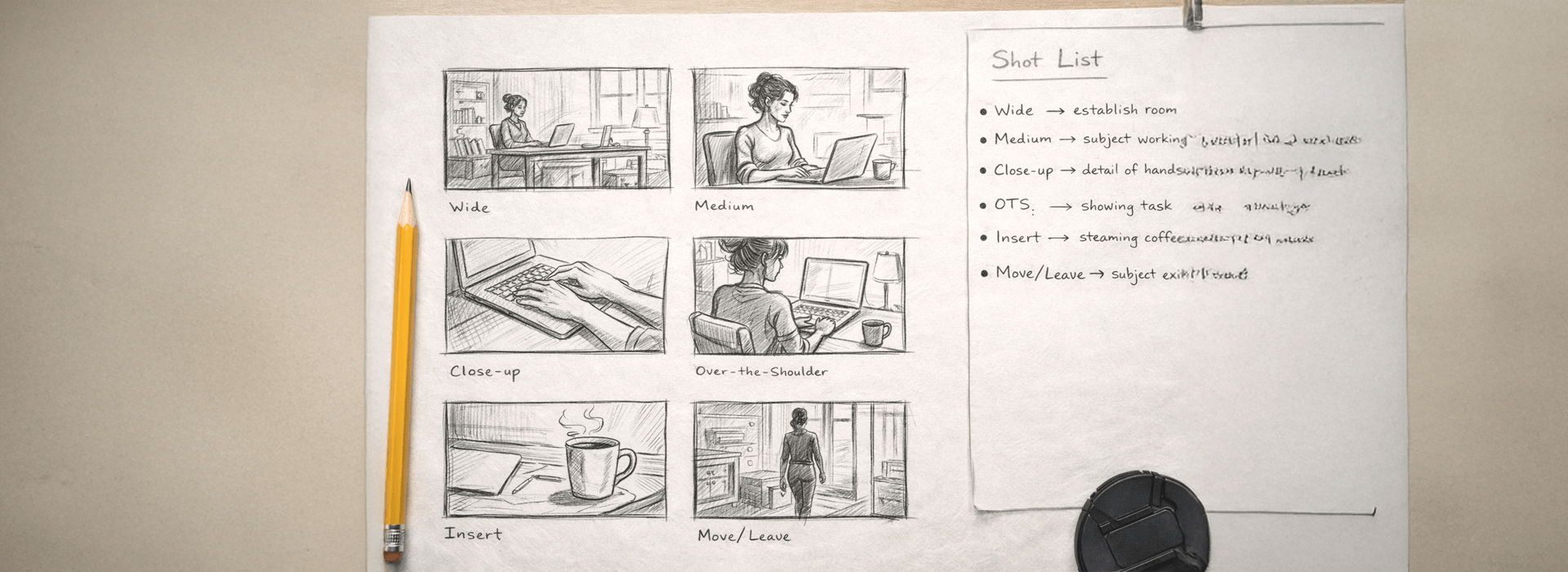
A basic storyboard or shot list doesn’t need to be pretty. It needs to clarify geography, emphasis, and progression, which is why this storyboard guide from Adobe is a sensible reference for mapping shot choice to scene setup, emotional focus, and relationships inside the frame.
Here’s a quick example for a 60-second branded profile of a student ceramic artist preparing for a weekend market.
Scene objective
Show that the work is handmade, careful, and ready for sale.
Core shot plan
wide shot of the studio to establish place
medium shot of the artist glazing a mug
close-up of the brush touching the rim
over-the-shoulder shot checking finished pieces on the shelf
short B-roll insert of price tags and wrapping paper
final shot carrying a crate out of the studio door
That’s already enough to shape the shoot. You know where the scene starts, where attention should land, and which details can carry emotion and texture. You’re no longer hoping the footage will somehow form a story later.
Framing Should Guide Attention
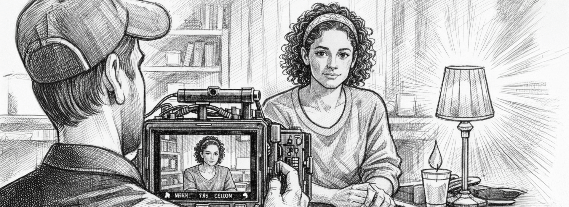
A stronger shot is not only about framing. Removing background clutter helps keep attention on the speaker instead of letting other details compete for focus.
Composition isn’t only about making the frame look balanced. It’s about telling the viewer where to look, what to notice first, and how a subject relates to the space around them.
Learning the rule of thirds in filmmaking and photography early on can make it much easier to think about emphasis, balance, tension, and negative space before you start breaking the rule on purpose.
One helpful test is to ask two quiet questions before pressing record. What should the viewer notice first? What should they notice second? If the answer isn’t obvious, the frame may be trying to do too much.
That idea matters because good framing doesn’t just decorate a scene. It gives the scene readable visual grammar, which the American Society of Cinematographers explores in its discussion of camera placement and shot craft.
Social-first framing tweaks that still protect the story
Modern creators often need one shoot to work across horizontal and vertical formats. That doesn’t change the craft, but it does change how careful you need to be with centre-weighted action, headroom, text-safe space, and the first frame.
A few things tend to matter most here.
keep the subject readable in the middle third if vertical cropping is likely
don’t hide the key action on the far edges of a wide frame
let your first frame explain itself quickly on short-form edits
shoot a little looser when you know alternate crops are coming
Social-first work still benefits from the same old discipline. Clear subject emphasis. Clean visual hierarchy. Coverage that gives the edit room to move.
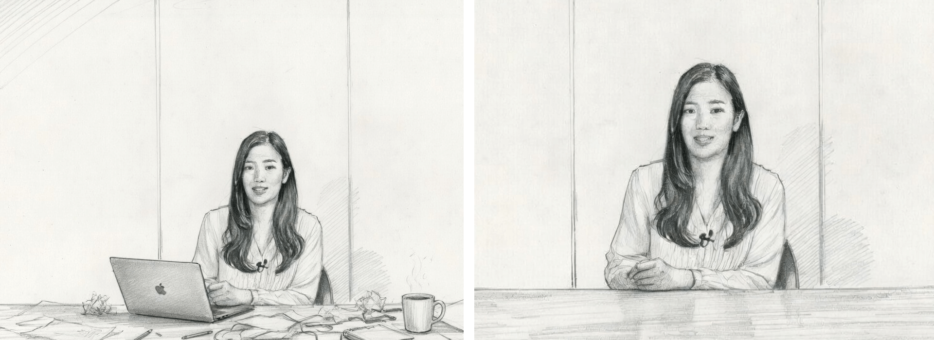
Coverage Is What Saves the Cut
Coverage is easy to underrate because it feels repetitive on set. In the edit, it’s often the thing that saves the sequence. It gives you options for pace, clarity, contrast, and recovery when one shot doesn’t work as well as you hoped.
A simple coverage set for most scenes includes the following.
Master shot for geography and movement through the space
Medium shot for the main action or performance
Close-up for emotional emphasis or a key line
Reaction shot for response and tone shift
Over-the-shoulder shot for connection and eyeline context
Insert shot for objects, hands, screens, notes, or small details that help carry the edit
If one shot in that set is missing, the edit often tells you fast. The scene may feel trapped, rushed, flat, or unclear.
Here’s how that same ceramic-artist example works when coverage is planned rather than guessed.
the wide shot gives place and context
the medium shot carries process and rhythm
the close-up makes the craft feel tactile
the insert gives you an elegant cut point
the final carrying shot gives the scene a sense of completion
That’s not over-shooting. It’s just enough coverage to let the edit breathe.
B-Roll Adds Context and Feeling
Using B-roll to add depth and emotion works best when the supporting footage adds context, texture, or rhythm rather than just filling space between talking points.
The useful test is simple. Does the B-roll change understanding, feeling, or rhythm? If it does one of those jobs clearly, it’s probably earning its place. If it does none of them, it may just be wallpaper.
B-roll also helps cover joins, sharpen transitions, and keep the viewer anchored in a place or process. The relationship between primary footage and supporting shots becomes much clearer when you look at how A-roll and B-roll work together in practice.
Colour Should Support the Story Already in Motion
Colour tends to work best when it confirms a direction the story has already earned. Warmth can soften a moment. Cooler tones can create distance. Strong contrast can make a frame feel energetic, uneasy, or stylised. But colour rarely fixes weak story logic on its own.
For creators shaping mood deliberately, colour psychology for filmmakers can be useful when the scene already has a clear emotional direction and audience in mind.
On real shoots, colour decisions often begin before grading. They begin with wardrobe, props, location choices, skin tone contrast, and how subject and background separate from one another. If those choices fight each other on set, the grade may only partly smooth it over later.
| Project type | What tends to matter most first | What can stay simpler |
|---|---|---|
| Interview-led video | Clear subject intention, consistent eyeline, room geography, and enough cutaways to protect pacing and clarity in the edit | Flashy movement, heavy visual styling, and extra camera tricks that do not add much to the story |
| Short branded piece | One clear story turn, a strong opening frame, and a small number of detail shots that make the product, person, or action feel specific | A dense plot, too many locations, or visual ideas that compete with the main message |
| Student scene | A clear scene objective, readable blocking, a solid master shot, and reaction coverage that helps the emotional beats land | Complicated rigs, ambitious movement, or coverage that exists only because it seems cinematic |
| Social-first video | First-frame clarity, crop-safe framing, pace, and purposeful inserts or cutaways that keep attention without confusing the viewer | Polished but empty style, overbuilt transitions, or extra visual effects that slow down the message |
This order matters because creators often spend time on the wrong layer of the work. They think about colour before coverage. They add movement before deciding what the shot is meant to communicate. They chase style while the scene still needs structure.
Common Mistakes That Flatten the Story
A few mistakes turn up again and again.
framing a subject neatly but not clearly
relying on one angle for too long
shooting B-roll without knowing what edit problem it solves
using colour for effect without matching the mood of the scene
adding style where the story still needs shape
A lot of those problems show up in familiar rookie filmmaking mistakes, especially when creators rush past framing, pacing, and shot clarity too early.
Start Here If You Want a Sensible Learning Path
If you’re new to filmmaking craft, the cleanest order is usually this.
get the scene objective clear
shape a simple visual plan
frame for emphasis rather than decoration
shoot enough coverage to protect the cut
use B-roll and colour to deepen what’s already working
That order won’t solve every creative problem, but it does stop the common mistake of trying to polish a scene that still isn’t clear.
Key takeaways
Story gives visual choices their job
Framing should guide attention before it tries to impress
Coverage is what gives the edit clarity and freedom
B-roll and colour work best when they support meaning that’s already there
Go deeper into the part of filmmaking craft you need next. These guides take a narrower look at structure, framing, B-roll, colour, and common early mistakes without repeating what’s already covered here.
| Article | Best for | Who it suits |
|---|---|---|
|
|
Learning how subject placement, balance, and negative space can guide attention and improve clarity in the frame | Creators, students, and photographers moving into video who want stronger composition without making every shot feel overdesigned |
| Understanding how setup, escalation, and payoff help a video or scene feel more purposeful from the start | Film students, beginner screen storytellers, and creators who have ideas but struggle to shape them into something that holds attention | |
| Using B-roll to add context, texture, and emotional weight while also helping awkward joins and pacing issues in the edit | Interview-led creators, documentary beginners, branded content makers, and small teams who want more than just filler cutaways | |
| Making colour choices that support tone, audience expectation, and first-impression impact without relying on colour alone to carry the story | Social-first creators, student filmmakers, and visually led storytellers who want mood decisions to feel more intentional |