
How Filmmakers Can Use Colour Psychology to Hook Audiences

Many filmmakers learn colour backwards. They pick a look they like, push it in the grade, and hope the scene will feel sharper, deeper, or more cinematic. Sometimes it works for a frame grab. Often it does not hold up once the performance, pacing, and story start doing the real work.
Colour psychology becomes useful when you stop treating it as decoration and start treating it as guidance. It can help an audience feel tension sooner, read a relationship faster, and know where to look before a line of dialogue lands. That is what makes it worth learning. It also sits inside the wider craft of visual decision-making, which is why this topic connects naturally with visual storytelling for modern creators rather than living as a stand-alone grading trick.
What colour psychology actually means in filmmaking
Colour psychology is not a hard rulebook. Red does not always mean danger. Blue does not always mean sadness. The same hue can feel warm, artificial, lonely, playful, or threatening depending on the lighting, wardrobe, contrast, and context around it.
That is why the better question is not what a colour means in theory. It is what that colour is doing in this scene. A warm amber practical in the background may suggest comfort in one film and emotional stagnation in another. The viewer is reading the whole image at once.
This matters because colour often works before the audience could explain it. A frame can feel brittle, calm, intimate, cold, or uneasy almost immediately. When the palette is doing its job, it helps the viewer read the emotional world without pulling attention away from the scene itself.
Start with the feeling, not the palette
The most reliable way to make colour feel intentional is to begin with the audience response you want.
Ask one question before you light, style, or grade the scene. What should the viewer feel first?
Maybe it is pressure. Maybe it is tenderness, distance, friction, relief, or uncertainty. Once that is clear, colour becomes easier to control because you are making decisions in support of a feeling rather than collecting attractive references and hoping they add up.
A practical sequence looks like this
Name the dominant feeling
Choose one main colour family
Add one contrast only if it helps the scene read faster
Decide how restrained or stylised the image should be
Check whether location, wardrobe, and props already support the plan
That final step matters more than many beginners expect. If the room is already full of conflicting colours, the grade will spend half its energy cleaning up a problem that should have been spotted before the shoot.
Why colour can hold attention so quickly
Colour is one of the first things a viewer processes. Before they fully register the dialogue or the blocking, they are already reacting to warmth, coolness, contrast, saturation, and separation inside the frame.
That does not mean louder is better. In fact, one of the fastest ways to flatten an image is to make every element compete at the same intensity. If everything is bright, urgent, and highly saturated, the eye has nowhere useful to go.
A controlled palette usually holds attention better because it creates hierarchy. It tells the viewer what matters first. One warm face against a cooler room. One strong red prop in an otherwise neutral shot. One patch of colour that signals danger, desire, or interruption without turning the whole frame into noise.
A scene breakdown you can actually use
Imagine a short kitchen scene between two friends after an argument. One wants to repair the relationship. The other has already started to pull away.
A weak approach would be to push strong teal and orange contrast across the whole image because conflict feels like it should look dramatic. That may give you a striking still, but it can also make the moment feel borrowed. The audience notices the treatment before they notice the emotional distance.
A better approach is more selective. Keep the room mostly neutral. Let one side of the frame lean slightly warm through a practical lamp, warmer wall bounce, or wardrobe choice. Let the other side stay a little cooler through window light or a less inviting background tone. Then block the conversation so the person trying to reconnect sits closer to that warmer area while the more withdrawn character stays in the cooler space.
Now colour is supporting the relationship instead of announcing itself. You are not forcing a symbol on the audience. You are shaping the frame so the emotional divide reads more quickly.
The useful habit is this. Do not ask which colour looks cinematic. Ask what contrast helps this particular moment land.
Where filmmakers usually go wrong
The first mistake is leaving colour too late. By the time you are grading, many of the important decisions have already been made by the room, the wardrobe, and the light sources you chose or ignored.
The second is pushing style before correction. If exposure and white balance are unstable, adding a strong look usually makes the image feel messier rather than more purposeful.
The third is sacrificing skin tones for mood. Unless the piece is deliberately stylised, faces usually carry more trust than the background. If skin starts looking muddy, green, grey, or oddly magenta, the viewer often feels the problem even if they cannot name it.
The fourth is treating every scene as if it needs the same level of intensity. Strong colour works best when it has somewhere to go. If every moment is fully pushed, the visual language stops giving the audience useful signals.
Build the palette before you shoot
You do not need a giant mood board. In many cases, two or three well-chosen reference images are more useful than twenty vague ones.
Look for what they are actually doing. Is the image mostly neutral with one accent colour? Are the blacks soft or punchy? Does the warmth come from lighting, wardrobe, or production design? Is the scene emotionally open or visually compressed?
Then test your own setup in the actual location. Even a quick phone test can reveal whether the wardrobe disappears into the wall, whether the practicals are too orange, or whether the window light is fighting the room. These are the decisions that make grading easier later.
How to make colour work on phones and small screens
A grade that feels rich on a large display can fall apart on a phone. The answer is not to make everything flatter. It is to protect readability first.
Check these three things before you worry about style
Does the face still look believable
Does the main subject separate clearly from the background
Does the contrast still feel controlled instead of brittle
If those three are working, the image usually has a much better chance of surviving different screens and brightness settings. This is one reason restrained grades often travel better than overworked ones. They give the viewer a clear visual priority instead of relying on subtle shifts that may disappear on a smaller display.
A grading workflow that keeps you out of trouble
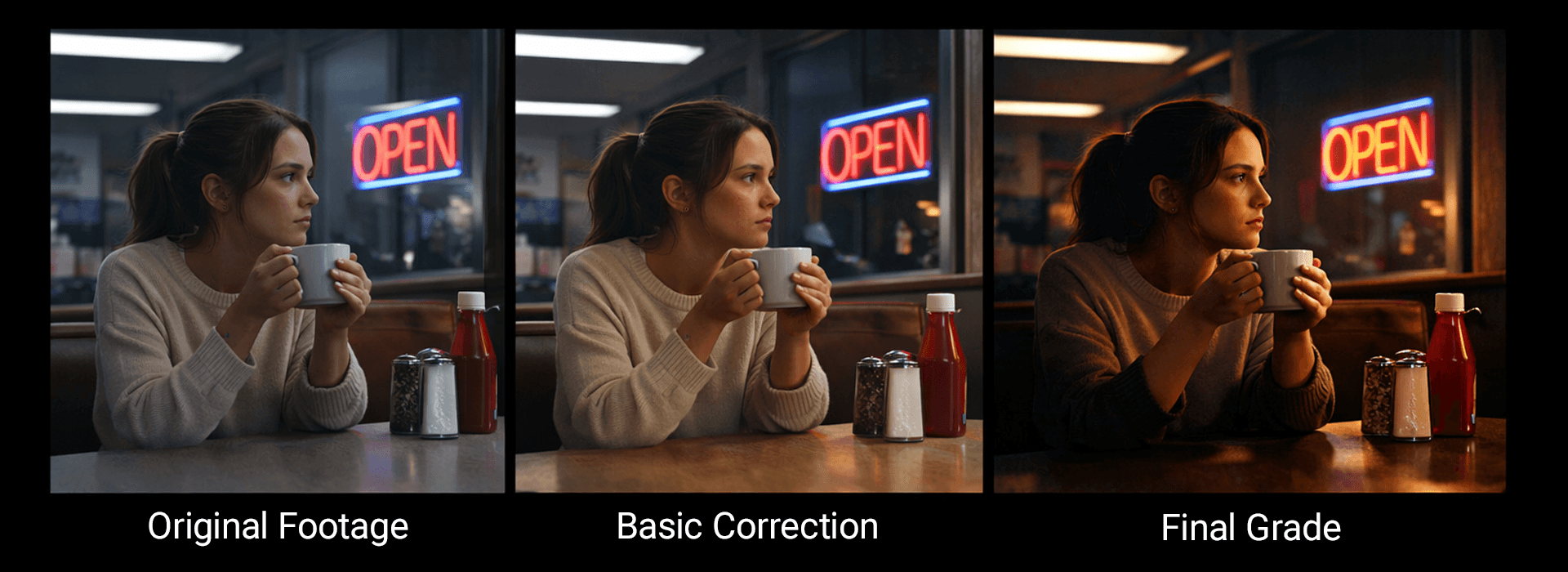
A simple colour workflow from original footage to correction and final grade. The key lesson is to correct first, then shape the look.
When you move into post, keep the order disciplined.
Correct first. Then shape. Then stylise.
That means stabilising exposure and white balance before you push saturation, contrast, or split tones. It means protecting skin before chasing atmosphere. It means making sure the image already works without the look, because strong grading is usually more convincing when it grows out of a solid base rather than covering for a weak one.
Many filmmakers build those habits in DaVinci Resolve because the software combines editing, correction, and colour tools in one workflow, including a free version that is still serious enough for real learning and repeatable grading practice.
If the image still feels wrong after you set the Kelvin value, the problem may not be temperature alone. ARRI’s colour FAQ is useful on that point because it separates colour temperature from green-magenta tint, which is often where mixed lighting starts to look unpleasant on faces.
Use colour meanings as prompts, not rules
Colour meanings can give you a useful starting point, but they are not fixed rules. The same colour can feel very different depending on lighting, contrast, costume, setting, and performance. This table works best as a quick reference when you are shaping mood, not as a formula to follow blindly.
| Colour | Common Associations | Useful On Screen When You Want To... | What to Watch For |
|---|---|---|---|
| Red | Urgency, sensuality, instability, confrontation | Signal tension, desire, conflict, danger, or a visual interruption | It can dominate the frame very quickly and drown out subtler emotional beats |
| Blue | Calm, distance, reflection, clinical restraint | Suggest isolation, thoughtfulness, control, coolness, or emotional withdrawal | Too much can make a scene feel flat, cold, or emotionally remote |
| Yellow | Openness, energy, strain, overstimulation | Create alertness, warmth, nervous energy, or unease with brightness | It can feel harsh or tiring if it becomes too bright or too dominant |
| Green | Growth, envy, artificiality, unease | Introduce ambiguity, imbalance, uneasiness, or a slightly unnatural edge | It can make skin tones look unpleasant if it is not carefully controlled |
| Purple | Mystery, stylisation, intensity, unreality | Push a dreamlike mood, heighten drama, or create a more designed world | It can feel decorative rather than meaningful if the scene does not support it |
| Pink | Tenderness, playfulness, irony, heightened design | Add softness, irony, personality, playfulness, or strong visual identity | It can feel too self-aware or tonally off in more serious scenes |
| Orange | Warmth, liveliness, boldness, slight exaggeration | Bring energy, invitation, vitality, or stronger subject separation | It can look forced if paired with heavy contrast or pushed too far in the grade |
These are not fixed meanings. They are starting points. The better question is whether the colour supports the performance, setting, and story pressure in the scene you are building.
What to try on your next shoot
Keep the exercise small enough to learn from it properly.
Pick one emotion and design one short scene around it. Choose one dominant colour family and one supporting contrast. Then make three versions of the same shot. One neutral. One gently stylised. One pushed too far.
That comparison teaches faster than another hour of generic advice because it shows you exactly where mood becomes noise. It also helps you spot your own habits. You start seeing whether you tend to underplay contrast, oversaturate backgrounds, or reach for the same emotional colour cues every time.
A useful visual for this page would be one annotated frame sequence showing the shot as captured, the corrected version, and the final grade, with brief notes on skin tone, focal separation, and the chosen colour contrast. That would make the teaching more concrete and lift the post beyond theory.