
Lower Thirds for Beginners: Simple Design Tips
Last updated: March 30, 2026
Over years of editing videos for creators and brands, I've noticed one detail that quietly separates amateur clips from ones that feel truly professional. Clean, well-designed lower thirds make that difference. They introduce people, highlight locations, or reinforce branding without distracting from the story.
Many beginners hold back, worried they'll look overdone or complicated. The truth is, good lower thirds are straightforward to create and deliver big impact. If you're not using them yet, you're leaving polish on the table that your audience notices. Let me guide you through everything you need to get started, based on what works in real projects.
What Lower Thirds Are and Why They Help
Lower thirds are the text overlays that appear in the lower part of the screen. They typically show names, titles, locations, or key facts. Think "Sarah Jones, Founder" or "London, UK" in an interview or travel vlog.
They serve clear purposes. They quickly identify speakers who have been off-screen, add instant credibility by showing roles or companies, and tie visuals to your brand through consistent fonts and colours. Used well, they keep viewers oriented, boost perceived production quality, and improve clarity in the finished edit. They also work across formats from YouTube to TikTok.
The best part is simplicity. A clean line of text often outperforms flashy graphics.

Examples showing how you can get creative with different font types and positions when creating a lower third, as demonstrated in a 16:9 widescreen format.
A Quick Look at Their History
Lower thirds have evolved from clunky TV overlays to essential tools for all creators. This timeline highlights the key milestones that made them what they are. Today they appear everywhere, from podcasts to short-form clips.
| Year | Milestone |
|---|---|
| 1954 | Early TV news uses physical cards and slides for names and tickers. |
| 1968 | Electronic character generators make text smoother and more reliable. |
| 1976 | Chyron launches its first digital system, becoming a broadcast standard. |
| 1985 | Colour and basic animations arrive as networks like CNN adopt them widely. |
| 1995 | Adobe Premiere brings digital editing to desktops, opening lower thirds to independents. |
| 2007 | YouTube's growth pushes lower thirds into creator content. |
| 2015 | Social platforms drive vertical designs and mobile-first thinking. |
Practical Design Tips for Beginners
Start simple and build confidence. Choose clean sans-serif fonts like Helvetica or Roboto for readability. Pick colours that stand out clearly against your footage. Make sure text remains easy to read for everyone. Strong contrast helps viewers with visual impairments too.
Position traditionally in the lower left or right, but feel free to experiment once comfortable. Offset placements or mid-screen bars can add energy if they suit your style.
Keep text concise. A name and title work better than long sentences. Time each graphic for 3-6 seconds, enough to read without lingering.
Here is a quick checklist I use with clients:
Use 1-2 fonts maximum
Limit to essential information
Ensure strong background contrast
Add subtle fade-in/out animation
Test legibility on mobile screens
Stay within title-safe zones
Look through magazines for font inspiration. Fashion, tech, or lifestyle titles often feature bold yet readable typography you can adapt.
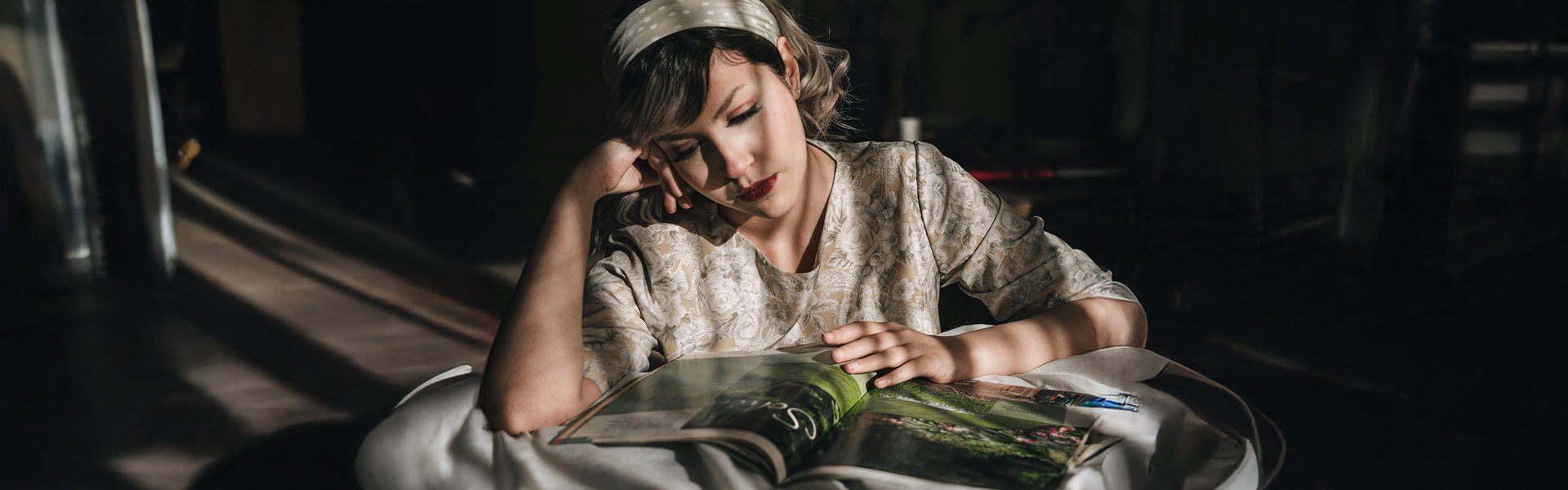
Photo by Ardalan Hamedani
Common Mistakes and How to Avoid Them
Even experienced editors slip up sometimes. Here are the pitfalls I see most often, with simple ways to steer clear:
Overloading with text: Packing in too much information overwhelms viewers and dilutes the message. Stick to the essentials only.
Poor contrast: Text that blends into busy backgrounds becomes hard to read. Always preview against different parts of your footage.
Bad timing: Graphics that linger too long disrupt pacing; ones that disappear too quickly feel rushed. Aim for 3-6 seconds as a guide.
Wrong placement: Positioning outside safe zones risks cropping on TVs or mobile devices. Keep key elements well inside the edges.
Ignoring accessibility: Low-contrast colours or complex fonts exclude some viewers. Prioritise clear, high-contrast designs.
Review each lower third against real footage before final export.
Adapting for Different Screen Sizes
Lower thirds must work across formats. On widescreen (16:9) you have room for longer lines or subtle logos. In portrait (9:16) for Stories or TikTok, keep text compact and positioned higher to avoid controls or cropping.
Test designs on phones and desktops. What looks balanced on a large monitor can feel cramped vertically.
Your images demonstrate this perfectly. The spacious widescreen examples compared to the tighter portrait versions.

Demonstrating lower third styles: Widescreen vs Portrait mode showing different styles.
Creative Uses and Current Trends
Lower thirds go beyond names and titles. In travel content, destination tags immerse viewers immediately, while wildlife videos benefit from species labels paired with habitats. Corporate pieces gain authority from clear job titles.
Motion-tracked graphics that follow moving subjects add polish and are achievable in most editing software. Current trends favour minimalism with occasional bold accents, using subtle gradients, clean animations, and brand-aligned typography. Vertical-first design continues to grow as short-form platforms lead consumption.
Key Takeaways
Here is a handy summary of the main points to keep in mind when designing your own lower thirds:
| Area | Tip | Why It Matters |
|---|---|---|
| Readability | Strong contrast, simple fonts | Ensures everyone can read easily |
| Timing | 3-6 seconds per graphic | Maintains natural pacing |
| Information | Keep text concise | Prevents overwhelming viewers |
| Placement | Respect safe zones, adapt per format | Avoids cropping on different devices |
| Accessibility | Strong contrast and clear fonts | Includes wider audience |
These principles create lower thirds that enhance rather than distract.
Ready to add professional lower thirds to your next project? Try the tips on a short test clip first. Want hands-on guidance or feedback on your designs? Explore our workshops or get in touch for personalised advice.